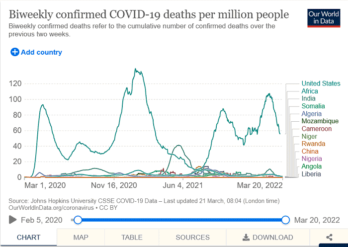
It's been observed since the beginning of the pandemic how much higher the COVID death rate is in the U.S. compared to overcrowded, impoverished, 3rd world countries, where ivermectin and hydroxychloroquine are as endemic as the parasites and malaria they are administered to treat.
https://www.bitchute.com/video/xR4druFBssHd/This chart compares death rates between the U.S. and several 3rd world countries since the beginning of the pandemic. Click on link for current:
https://ourworldindata.org/grapher/biweekly-covid-deaths-per-million-people?tab=chart&country=USA~AGO~DZA~CHN~IND~SOM~RWA~NGA~NER~MOZ~LBR~Africa~CMR
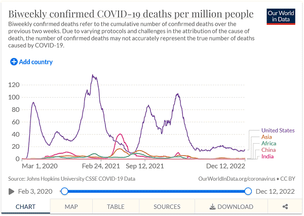
By region:
https://ourworldindata.org/grapher/biweekly-covid-deaths-per-million-people?tab=chart&country=USA~IND~Africa~Asia~CHN(Chart updated 12-12-22)

The chart at the link shows the COVID death rates in selected countries from the onset of the pandemic. Before questioning their ability to count in some of those countries,
the WHO doesn't seem to have a problem with posting the numbers, if indeed they aren't in large measure responsible for the count.
Compare the death rate in the relatively non-hydroxychloroquine non-ivermectin U.S., to crowded, poor, considerably unsanitary however hydroxychloroquine-rich and ivermectin-rich India, since the beginning of the pandemic:
https://ourworldindata.org/grapher/biweekly-covid-deaths-per-million-people?tab=chart&country=IND~USAAlso note in the chart at the following link the resumption of genocide in Mexico after they halted the use of ivermectin. Move the date marker to around
Jan 4th, 2022 which is when they stopped using ivermectin.
https://ourworldindata.org/grapher/biweekly-covid-deaths-per-million-people?tab=chart&country=~MEXThe U.S. has maintained a death rate over 100 times higher than several 3rd world countries, while last checked
the U.S. COVID death rate is 522 times that of China. The reasons for this are that from the beginning of the pandemic China has treated early with hydroxychloroquine protocols (probably from
NIH recognition of HCQ's value against SARS corona viruses at least as far back as 2005), as well as China's vaccinating their citizens with more
traditional styled vaccines made from attenuated or dead viruses and viral debris, rather than the novel,
leaky,
experimental, investigational, innate
immune response reprogramming,
mRNA "
vaccines" employed in the U.S.
China's death rate at 1/522 that of the U.S. should not be surprising in light of their early treatment with hydroxychloroquine, since competent clinicians here in the U.S. have enjoyed even greater success. Like Dr. Vladimir Zelenko that reported on March 23rd of 2020 having
100% success in early treatment of his first 500 elderly and high-risk patients, or
Dr. Brian Tyson's and Dr. George Fareed's 100% success among those that showed up on on a timely basis
of their 7,000 patients, or those at myfreedoctor.com have
treated 150,000 patients with only 4 fatalities, for a 99.99% success rate. All patients of those outstanding competent clinicians, of course being treated in the comfort of their own homes, with cheap generic drugs and nutraceuticals at about $20 per full protocol in the U.S. In places like
India for only a few dollars, including a pulse oximeter!
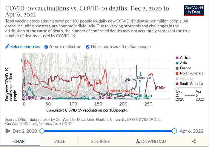
Recently noticed the faint grey lines at the right side of the following chart so added the countries and was shocked by what is captured in the screenshot below (the ascending green line is South Korea whose label was covered by Denmark's) (if you go to the link and add Hong Kong you are in for a
real stunner). The chart at the following link shows the COVID death rates and also includes the COVID vaccination rate for each country, from vaccine rollout.
https://ourworldindata.org/grapher/covid-vaccinations-vs-covid-death-rate?country=USA~IND~NGA~COG~AGO~DZA~BTN~ETH~COD~RWA~NER~TZA~CHN~CHL~KOR~NOR~DNKWhile it's labeled as COVID death rate, wouldn't it appear to be more of a vaccine-driven COVID death rate, since some of the most vaxxed countries are spiking the highest when the screen shot was taken?
Or perhaps simply more evidence of vaccine enhanced disease/antibody dependent enhancement/pathogenic priming?

The WHO produces the figures used in the Johns Hopkins data charts
(example Nigeria - to date 3,155 COVID deaths since the beginning of the pandemic - a little over a thousand per year, out of a population of 206 million people).
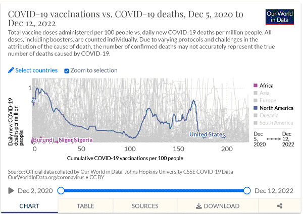
The reason that only Nigeria, Niger and Burundi's labels appeared when the following screenshot was taken, is because the labels for Congo, Chad, Madagascar, Tanzania, Camaroon, Nigeria, Ethiopia and Mali, were underneath them.
Current data:
https://ourworldindata.org/grapher/covid-vaccinations-vs-covid-death-rate?time=2020-12-05..latest&country=COG~BDI~TCD~MDG~TZA~NER~CMR~NGA~ETH~MLI~USA(Chart updated 12-12-22)
